A dashboard for fragile tests

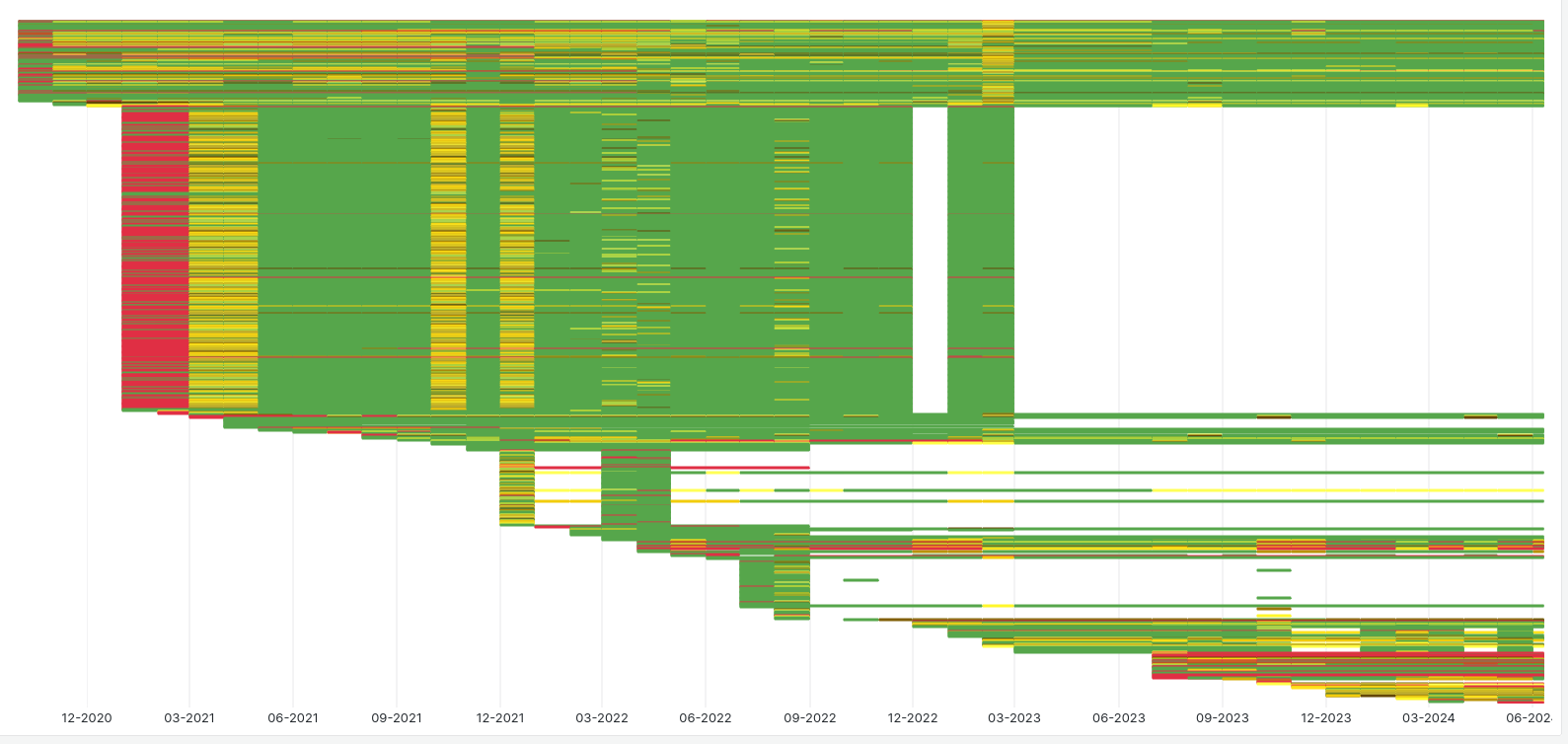
Hi all, This weekend at Zurihac, I wanted to start making it possible to explore fragile tests. Fragile tests are tests that pass nondeterministically. Marking them fragile means that they do not influence the overall success of the testsuite. It's been a way of sweeping problems under the rug. For a few years, the GHC test infrastructure has been recording fragile test results into a database. We record whether the test passed or failed. Now we can start peeking under the rug to see what kind of patterns have developed. I was mostly interested in whether or not fragile tests are truly fragile. It looks like many are not. The dashboard has bucketed results into months. Every cell shows the pass rate for a given month (column) and test (row). Red cells mean 0% success. Green cells, 100% success. Shades of yellow are everything in between. It's remarkable how much green there is. One would assume even fragile tests would fail for legitimate reasons sometimes! At this point, the visualization is mostly good for seeing large trends. Any other observations would be appreciated! The dashboard is interactive at https://grafana.gitlab.haskell.org/goto/XcuO3ZUIg?orgId=2 [image: image.png] -Bryan
participants (1)
-
 Bryan Richter