
I noticed a new haskell logo idea on a tshirt today, http://image.spreadshirt.net/image-server/image/configuration/13215127/produ... Simple, clean and *pure*. Instead of the "we got lots going on" of the current logo. Any graphic designers want to try some variations on this theme of purity? A new year, and a new mature logo... -- Don

On Sun, Dec 14, 2008 at 10:15 PM, Don Stewart <dons@galois.com> wrote:
I noticed a new haskell logo idea on a tshirt today,
http://image.spreadshirt.net/image-server/image/configuration/13215127/produ...
Simple, clean and *pure*.
I like it. I prefer the thick lambda over the script one and the circle provides nice framing. I'm no graphics designer though. Cheers, Johan

http://i35.tinypic.com/mjon83.png used this: http://www.simwebsol.com/ImageTool/Default.aspx 2008/12/14 George Pollard <porges@porg.es>:
?
_______________________________________________ Haskell-Cafe mailing list Haskell-Cafe@haskell.org http://www.haskell.org/mailman/listinfo/haskell-cafe

On 2008 Dec 14, at 16:50, sam lee wrote:
http://i35.tinypic.com/mjon83.png used this: http://www.simwebsol.com/ImageTool/Default.aspx
Win from the "visually interesting" angle, but massive lose from the "legibility" angle. -- brandon s. allbery [solaris,freebsd,perl,pugs,haskell] allbery@kf8nh.com system administrator [openafs,heimdal,too many hats] allbery@ece.cmu.edu electrical and computer engineering, carnegie mellon university KF8NH

On Sun, 14 Dec 2008 16:50:11 -0500, "sam lee" <skynare@gmail.com> wrote:
http://i35.tinypic.com/mjon83.png used this: http://www.simwebsol.com/ImageTool/Default.aspx
This logo still has not been uploaded to the "Haskell logos/New logo ideas" (http://haskell.org/haskellwiki/Haskell_logos/New_logo_ideas) page. Could you please upload it before it is forgotten? -- Benjamin L. Russell -- Benjamin L. Russell / DekuDekuplex at Yahoo dot com http://dekudekuplex.wordpress.com/ Translator/Interpreter / Mobile: +011 81 80-3603-6725 "Furuike ya, kawazu tobikomu mizu no oto." -- Matsuo Basho^

I like the proposed logo even more now that you've pointed out the similarity. :-) -Corey O'Connor 2008/12/14 George Pollard <porges@porg.es>:
?
_______________________________________________ Haskell-Cafe mailing list Haskell-Cafe@haskell.org http://www.haskell.org/mailman/listinfo/haskell-cafe

On Sun, Dec 14, 2008 at 3:15 PM, Don Stewart <dons@galois.com> wrote:
I noticed a new haskell logo idea on a tshirt today, http://image.spreadshirt.net/image-server/image/configuration/13215127/produ...
I'd buy one, but I'm not seeing it on spreadshirt.net.
brianchina60221:
On Sun, Dec 14, 2008 at 3:15 PM, Don Stewart <dons@galois.com> wrote:
I noticed a new haskell logo idea on a tshirt today, http://image.spreadshirt.net/image-server/image/configuration/13215127/produ...
I'd buy one, but I'm not seeing it on spreadshirt.net.

Don Stewart <dons@galois.com> writes:
I noticed a new haskell logo idea on a tshirt today,
http://image.spreadshirt.net/image-server/image/configuration/13215127/produ...
Simple, clean and *pure*.
Nice. For some more hubris, replace 'A' with 'The'. -k -- If I haven't seen further, it is by standing in the footprints of giants
ketil:
Don Stewart <dons@galois.com> writes:
I noticed a new haskell logo idea on a tshirt today,
http://image.spreadshirt.net/image-server/image/configuration/13215127/produ...
Simple, clean and *pure*.
Nice. For some more hubris, replace 'A' with 'The'.
I had the very same thought :) Stamp it home.

On Sun, Dec 14, 2008 at 2:38 PM, Don Stewart <dons@galois.com> wrote:
ketil:
Nice. For some more hubris, replace 'A' with 'The'.
I had the very same thought :)
It certainly wouldn't do to let, say, the existence of Concurrent Clean get in the way of our self-promotion. /g -- I am in here
"J. Garrett Morris" <jgmorris@cecs.pdx.edu> writes:
Nice. For some more hubris, replace 'A' with 'The'.
I had the very same thought :)
It certainly wouldn't do to let, say, the existence of Concurrent Clean get in the way of our self-promotion.
Well, they get to make T-shirts with "Clean - the /other/ purely functional language". Seriously though - thet text can be interpreted as Haskell, the purely functional language to distinguish it from Haskell, the county in Texas, or Haskell, the Indian Nations University....or for that matter Haskell, the logician. To avoid any hard feelings, I suggest either putting "Haskell the logician" (with a picture of same) on the back of the shirt, or replacing the text with just "purely functional" or similar. At any rate, "A" is to weak, and suggests just one of the crowd. -k -- If I haven't seen further, it is by standing in the footprints of giants

On 14 dec 2008, at 22:15, Don Stewart wrote:
I noticed a new haskell logo idea on a tshirt today,
http://image.spreadshirt.net/image-server/image/configuration/13215127/produ...
Simple, clean and *pure*.
Instead of the "we got lots going on" of the current logo.
Any graphic designers want to try some variations on this theme of purity?
I'm not a graphic designer, but that doesn't prevent me giving a try. (Transparant PNG, for best results view on a white background.) By the way, the font used (Kautiva) is not free. You might recognize it from Tupil's logo ;) -- Regards, Eelco Lempsink
eelco:
On 14 dec 2008, at 22:15, Don Stewart wrote:
I noticed a new haskell logo idea on a tshirt today,
http://image.spreadshirt.net/image-server/image/configuration/13215127/produ...
Simple, clean and *pure*.
Instead of the "we got lots going on" of the current logo.
Any graphic designers want to try some variations on this theme of purity?
I'm not a graphic designer, but that doesn't prevent me giving a try.
(Transparant PNG, for best results view on a white background.)
By the way, the font used (Kautiva) is not free. You might recognize it from Tupil's logo ;)
Could you attach it to the web page, http://haskell.org/haskellwiki/Haskell_logos/New_logo_ideas -- Don

On Sun, Dec 14, 2008 at 6:27 PM, Don Stewart <dons@galois.com> wrote:
Could you attach it to the web page,
I tossed up a quickie candidate there as well.

On 15 Dec 2008, at 03:27, Don Stewart wrote:
Could you attach it to the web page,
I've stuck a contender up there too. Bob

On Mon, 2008-12-15 at 02:57 +0100, Eelco Lempsink wrote:
On 14 dec 2008, at 22:15, Don Stewart wrote:
I noticed a new haskell logo idea on a tshirt today,
http://image.spreadshirt.net/image-server/image/configuration/13215127/produ...
Simple, clean and *pure*.
Instead of the "we got lots going on" of the current logo.
Any graphic designers want to try some variations on this theme of purity?
I'm not a graphic designer, but that doesn't prevent me giving a try.
(Transparant PNG, for best results view on a white background.)
By the way, the font used (Kautiva) is not free. You might recognize it from Tupil's logo ;)
Someone would pay for that font? It literally hurts my eyes.
On 15 dec 2008, at 03:31, Derek Elkins wrote:
On Mon, 2008-12-15 at 02:57 +0100, Eelco Lempsink wrote:
I'm not a graphic designer, but that doesn't prevent me giving a try.
By the way, the font used (Kautiva) is not free. You might recognize it from Tupil's logo ;)
Someone would pay for that font? It literally hurts my eyes.
Oh, I'm terribly sorry, I didn't mean to cause any harm. To sooth your eyes, I created another variation, which also features a tagline that, in my opinion, captures more closely the gist of the impression Haskell makes on most programmers. This one is dedicated to you, Derek. Good luck with your eyes. -- Regards, Eelco Lempsink

On Sun, 14 Dec 2008, Don Stewart wrote:
I noticed a new haskell logo idea on a tshirt today,
http://image.spreadshirt.net/image-server/image/configuration/13215127/produ...
Simple, clean and *pure*.
Instead of the "we got lots going on" of the current logo.
Call me conservative, but I like the current logo more than the new suggestions. Why isn't it shown big on the welcome page of haskell.org?
On 15 Dec 2008, at 12:43, Henning Thielemann wrote:
On Sun, 14 Dec 2008, Don Stewart wrote:
I noticed a new haskell logo idea on a tshirt today,
http://image.spreadshirt.net/image-server/image/configuration/13215127/produ...
Simple, clean and *pure*.
Instead of the "we got lots going on" of the current logo.
Call me conservative, but I like the current logo more than the new suggestions. Why isn't it shown big on the welcome page of haskell.org?
Are you referring to this logo? In which case, it is shown on Haskell.org, unless there's another logo that I don't know about? Personally, this logo I find cluttered, and complicated, which I suspect conveys something to people thinking about using Haskell. Bob


My entry... 2008/12/15 Martin DeMello <martindemello@gmail.com>:
Something incorporating λ∀ perhaps
martin _______________________________________________ Haskell-Cafe mailing list Haskell-Cafe@haskell.org http://www.haskell.org/mailman/listinfo/haskell-cafe

Looks, good, actually among the top of the ones I like, should we not have some kind of voting mechanism for selecting a logo? And also some kind of last date for when entries are accepted.. Of course this requires a call for logos and so forth. 2008/12/15 Jeff Heard <jefferson.r.heard@gmail.com>:
My entry...
2008/12/15 Martin DeMello <martindemello@gmail.com>:
Something incorporating λ∀ perhaps
martin _______________________________________________ Haskell-Cafe mailing list Haskell-Cafe@haskell.org http://www.haskell.org/mailman/listinfo/haskell-cafe
_______________________________________________ Haskell-Cafe mailing list Haskell-Cafe@haskell.org http://www.haskell.org/mailman/listinfo/haskell-cafe
-- Patience is the last resort for those unable to take action
Could you upload it to the logo contest page: http://haskell.org/haskellwiki/Haskell_logos/New_logo_ideas jefferson.r.heard:
My entry...
2008/12/15 Martin DeMello <martindemello@gmail.com>:
Something incorporating λ∀ perhaps
martin _______________________________________________ Haskell-Cafe mailing list Haskell-Cafe@haskell.org http://www.haskell.org/mailman/listinfo/haskell-cafe
_______________________________________________ Haskell-Cafe mailing list Haskell-Cafe@haskell.org http://www.haskell.org/mailman/listinfo/haskell-cafe


On 16 Dec 2008, at 1:24 am, Álvaro Vilanova Vidal wrote:
One more concept. <haskell_infinitylambda_logo.svg>
<haskell_infinitylambda.svg><haskell_infinitylambda.png>
The hybrid lambda/infinity sign looks more like a bra advertisement and the lettering is unpleasant. For one thing, the language is called "Haskell", so a logo should not call it "haskell". (The language cares very much about case, after all.) Admittedly lambda signifies functions to us, but there are probably more people who know what A -> B means than who know what lambda means. Arguably Haskell → → → → conveys something of the language (we do write f :: a -> b -> c -> d -> e for a multiparameter function) and also suggests something dynamic and forward-looking. Indeed, the multiple arrows even suggest concurrency, which is true.

So far this one is still the best, although the kerning between the s and the k seems off, so that would need fixing first. In terms of slogan "purely functional", "lazy with class", or "lazy. pure. functional." look ok. The rest, not so much. 2008/12/14 Don Stewart <dons@galois.com>:
I noticed a new haskell logo idea on a tshirt today,
http://image.spreadshirt.net/image-server/image/configuration/13215127/produ...
Simple, clean and *pure*.
Instead of the "we got lots going on" of the current logo.
Any graphic designers want to try some variations on this theme of purity?
A new year, and a new mature logo...
-- Don _______________________________________________ Haskell-Cafe mailing list Haskell-Cafe@haskell.org http://www.haskell.org/mailman/listinfo/haskell-cafe
-- Push the envelope. Watch it bend.
And anyone who does a version, place put it on the wiki. It'll be lost if you only post to the list. I propose we gather submissions and vote on the best for a new logo in 2009. -- Don nominolo:
So far this one is still the best, although the kerning between the s and the k seems off, so that would need fixing first.
In terms of slogan "purely functional", "lazy with class", or "lazy. pure. functional." look ok. The rest, not so much.
2008/12/14 Don Stewart <dons@galois.com>:
I noticed a new haskell logo idea on a tshirt today,
http://image.spreadshirt.net/image-server/image/configuration/13215127/produ...
Simple, clean and *pure*.
Instead of the "we got lots going on" of the current logo.
Any graphic designers want to try some variations on this theme of purity?
A new year, and a new mature logo...
-- Don _______________________________________________ Haskell-Cafe mailing list Haskell-Cafe@haskell.org http://www.haskell.org/mailman/listinfo/haskell-cafe
-- Push the envelope. Watch it bend.
On Mon, 15 Dec 2008, Don Stewart wrote:
And anyone who does a version, place put it on the wiki. It'll be lost if you only post to the list.
I propose we gather submissions and vote on the best for a new logo in 2009.
Whatever logo someone prefers: I have written a program using HPDF which creates stamps for the German post (see http://www.internetmarke.de/) with custom images: http://code.haskell.org/~thielema/internetmarke/ It needs a bit generalization, though, and will then be uploaded to Hackage, of course. So a dedicated Haskell stamp is close to German Haskell users!
On Mon, 15 Dec 2008, Henning Thielemann wrote:
On Mon, 15 Dec 2008, Don Stewart wrote:
And anyone who does a version, place put it on the wiki. It'll be lost if you only post to the list.
I propose we gather submissions and vote on the best for a new logo in 2009.
Whatever logo someone prefers: I have written a program using HPDF which creates stamps for the German post (see http://www.internetmarke.de/) with custom images: http://code.haskell.org/~thielema/internetmarke/
Try it out now: http://hackage.haskell.org/cgi-bin/hackage-scripts/package/internetmarke

On Dec 15, 2008, at 9:03 AM, Don Stewart wrote:
And anyone who does a version, place put it on the wiki. It'll be lost if you only post to the list.
I propose we gather submissions and vote on the best for a new logo in 2009.
I'm a big fan of those posted by FalconNL. I showed the whole page to a professional graphic designer and brand strategist, and she thought that the ">> Haskell" ones were the best of the complete designs, by far, from a design standpoint. I'm not sure which of the three I like best, though. She also really liked the recent symbol inspired by Darrin Thompson's ASCII art. Some variant of FalconNL's original designs with that symbol in place of the ">>" might look nice. The symbol could also be used on its own, which is a plus. Finally, she much preferred Officina Sans over Fonce Sans. It's sad that there are so few good free fonts to choose from, but I'd say it's better to go for the one that looks good. It can be embedded into a vector graphic. Aaron

Don Stewart wrote:
I noticed a new haskell logo idea on a tshirt today,
http://image.spreadshirt.net/image-server/image/configuration/13215127/produ...
Simple, clean and *pure*.
Instead of the "we got lots going on" of the current logo.
Any graphic designers want to try some variations on this theme of purity?
A new year, and a new mature logo...
Well overdue, IMHO. I showed the current logo to Mr C++ (who, obviously, is slightly biased). To him, apparently, the current logo says "Haskell is all about arcane and obscure mathematical constructs. In fact, we think that complicated mathematics is so good that we stuffed our logo full of it. If you don't like hard math, don't even bother trying to learn this language." Obviously, that's a rather negative image to be projecting. And obviously, his opinion is biased. To me, the logo just looks a) rather cluttered, and b) home-made. It doesn't have that professional "glitter" to it. (I have no idea how to fix that though - maybe ask a professional??) I see lots of people posting various logos, but they all seem to consist essentially of a lambda and the word "Haskell". I guess it depends on what you want from a logo. Is our "logo" going to be just a lambda symbol in a specific typeface with specific colours? Or do we want something more particular? (Looking at what other languages have... well "Ruby" has a gemstone. Duh. And "Python" has two snakes nicely stylised. Oh well!) But yeah, certainly I think having a neat T-shirt to wear would be fun! (Note that the lambda was the symbol for the LGBT folks though!) (Actually, just noticing... Ruby's front page says "Hello World is trivial - here it is!" We can do that too, eh?)

Don Stewart wrote:
I noticed a new haskell logo idea on a tshirt today,
http://image.spreadshirt.net/image-server/image/configuration/13215127/produ...
Simple, clean and *pure*.
While "lambda in a circle" is quite powerful, it's also quite similar to the logo for the rather popular game "Half-Life" (especially if orange is used). I'm not sure if this is relevant. http://images.google.com/images?q=half+life+logo -Michael
mgg:
Don Stewart wrote:
I noticed a new haskell logo idea on a tshirt today,
http://image.spreadshirt.net/image-server/image/configuration/13215127/produ...
Simple, clean and *pure*.
While "lambda in a circle" is quite powerful, it's also quite similar to the logo for the rather popular game "Half-Life" (especially if orange is used). I'm not sure if this is relevant. http://images.google.com/images?q=half+life+logo
Haskell and Scheme have been using lambda in a circle for 20+ years, also... -- Don

Alvaro's infinity lambda is awesome! The fancy treatments -- shadows, reflections, and the funny haskell font can all go, but the infinity lambda is distinctive, conceptually clear, and conveys the notion that we're not just the lambda calculus, but the lambda calculus to the power of our type system. Speaking of which, maybe the lambda cube could be the basis for a logo? --S
On Mon, 2008-12-15 at 18:25 -0500, Sterling Clover wrote:
Alvaro's infinity lambda is awesome! The fancy treatments -- shadows, reflections, and the funny haskell font can all go, but the infinity lambda is distinctive, conceptually clear, and conveys the notion that we're not just the lambda calculus, but the lambda calculus to the power of our type system. Speaking of which, maybe the lambda cube could be the basis for a logo?
Haskell sits in the middle of one of the faces of the lambda cube, possibly even a bit in the volume, though I don't think so.

okay, I want a t-shirt like this (but with all the greek letters and formatting) back: \t. 2^-t kg is equally[or: sometimes] bothered by math front: \gbtq is [sometimes] bothered by acronyms :-) or, sometimes likes each of them :-) -Isaac

We could take the HL2 logo and replace the "2" with "6". I'm sure there's some trademark issue here, but i like the idea. /jve On Mon, Dec 15, 2008 at 5:52 PM, Michael Giagnocavo <mgg@giagnocavo.net>wrote:
Don Stewart wrote:
I noticed a new haskell logo idea on a tshirt today,
http://image.spreadshirt.net/image-server/image/configuration/13215127/produ...
Simple, clean and *pure*.
While "lambda in a circle" is quite powerful, it's also quite similar to the logo for the rather popular game "Half-Life" (especially if orange is used). I'm not sure if this is relevant. http://images.google.com/images?q=half+life+logo
-Michael _______________________________________________ Haskell-Cafe mailing list Haskell-Cafe@haskell.org http://www.haskell.org/mailman/listinfo/haskell-cafe

My $0.02 us: Apologies for ascii art, and hopefully gmail doesn't munge this: ---- ---- \ \ \ \ ------------ \ \ \ \ \ | \ \ \ \ ----------- \ \ \ \ / / / \ -------- / / / \ \ | / / / /\ \ ------- / / / / \ \ ---- ---- ---- -- Darrin

On Tue, 2008-12-16 at 12:40 -0500, Darrin Thompson wrote:
My $0.02 us:
Apologies for ascii art, and hopefully gmail doesn't munge this:
---- ---- \ \ \ \ ------------ \ \ \ \ \ | \ \ \ \ ----------- \ \ \ \ / / / \ -------- / / / \ \ | / / / /\ \ ------- / / / / \ \ ---- ---- ----
--- -------- / / / ____ \ / / / / \ \ / / --- / / / / / / \ \ \ \ \ \ --- \ \ \ \ \ \____/ / \ \ \ / --- --------

On Tue, Dec 16, 2008 at 11:40 AM, Darrin Thompson <darrinth@gmail.com>wrote:
My $0.02 us:
Apologies for ascii art, and hopefully gmail doesn't munge this:
---- ---- \ \ \ \ ------------ \ \ \ \ \ | \ \ \ \ ----------- \ \ \ \ / / / \ -------- / / / \ \ | / / / /\ \ ------- / / / / \ \ ---- ---- ----
-- Darrin
I really like this idea. It incorporates two important ideas and is simple enough to look good at different sizes; plus, it doesn't look like the Half-life logo. My biggest concern is that to someone not already familiar with Haskell syntax, it might be confusing. (That may or may not be an actual problem.) Nathan Bloomfield

Darrin Thompson <darrinth <at> gmail.com> writes:
My $0.02 us:
Apologies for ascii art, and hopefully gmail doesn't munge this:
I love this ASCII-art version. I tried to make a vector version of it in Photoshop, and I came up with this [1] and [2]. Any critiques/suggestions? I'm thinking about a second version that more obviously defines the second '>' with color from the bottom-right part of the lambda. Jeff Wheeler [1]: http://media.nokrev.com/junk/haskell-logos/logo1.png [2]: http://media.nokrev.com/junk/haskell-logos/logo2.png
On Wed, 2008-12-17 at 02:47 +0000, Jeff Wheeler wrote:
Darrin Thompson <darrinth <at> gmail.com> writes:
My $0.02 us:
Apologies for ascii art, and hopefully gmail doesn't munge this:
I love this ASCII-art version. I tried to make a vector version of it in Photoshop, and I came up with this [1] and [2].
Any critiques/suggestions? I'm thinking about a second version that more obviously defines the second '>' with color from the bottom-right part of the lambda.
Jeff Wheeler
[1]: http://media.nokrev.com/junk/haskell-logos/logo1.png [2]: http://media.nokrev.com/junk/haskell-logos/logo2.png
I like the first version better. :) I'd suggest making the lambda/arrow a bit straighter and beefing up the size of the equals in relation to the rest of the symbol :)

George Pollard <porges@porg.es> writes:
On Wed, 2008-12-17 at 02:47 +0000, Jeff Wheeler wrote:
I love this ASCII-art version. I tried to make a vector version of it in Photoshop, and I came up with this [1] and [2].
Any critiques/suggestions? I'm thinking about a second version that more obviously defines the second '>' with color from the bottom-right part of the lambda.
Jeff Wheeler
[1]: http://media.nokrev.com/junk/haskell-logos/logo1.png [2]: http://media.nokrev.com/junk/haskell-logos/logo2.png
I like the first version better. :) I'd suggest making the lambda/arrow a bit straighter and beefing up the size of the equals in relation to the rest of the symbol :)
I also like the first better. If the equals was ever so slightly wider, it would be absolutely perfect.

mail@justinbogner.com wrote:
George Pollard <porges@porg.es> writes:
On Wed, 2008-12-17 at 02:47 +0000, Jeff Wheeler wrote:
I love this ASCII-art version. I tried to make a vector version of it in Photoshop, and I came up with this [1] and [2].
Any critiques/suggestions? I'm thinking about a second version that more obviously defines the second '>' with color from the bottom-right part of the lambda.
Jeff Wheeler
[1]: http://media.nokrev.com/junk/haskell-logos/logo1.png [2]: http://media.nokrev.com/junk/haskell-logos/logo2.png I like the first version better. :) I'd suggest making the lambda/arrow a bit straighter and beefing up the size of the equals in relation to the rest of the symbol :)
I also like the first better. If the equals was ever so slightly wider, it would be absolutely perfect.
The first is real nice.

2008/12/17 Neal Alexander <wqeqweuqy@hotmail.com>:
mail@justinbogner.com wrote:
George Pollard <porges@porg.es> writes:
On Wed, 2008-12-17 at 02:47 +0000, Jeff Wheeler wrote:
I love this ASCII-art version. I tried to make a vector version of it in Photoshop, and I came up with this [1] and [2].
Any critiques/suggestions? I'm thinking about a second version that more obviously defines the second '>' with color from the bottom-right part of the lambda.
Jeff Wheeler
[1]: http://media.nokrev.com/junk/haskell-logos/logo1.png [2]: http://media.nokrev.com/junk/haskell-logos/logo2.png
I like the first version better. :) I'd suggest making the lambda/arrow a bit straighter and beefing up the size of the equals in relation to the rest of the symbol :)
I also like the first better. If the equals was ever so slightly wider, it would be absolutely perfect.
The first is real nice.
It has a military feeling I don't like... Cheers, Thu
It has a military feeling I don't like...
Might look cuddlier with slightly rounded edges. That's what all the cool kids[1] are doing anyway ;) [1]: http://www.python.org/

Any critiques/suggestions? I'm thinking about a second version that
more
obviously defines the second '>' with color from the bottom-right part of the lambda.
Jeff Wheeler
[1]: http://media.nokrev.com/junk/haskell-logos/logo1.png [2]: http://media.nokrev.com/junk/haskell-logos/logo2.png I like the first version better. :) I'd suggest making the lambda/arrow a bit straighter and beefing up the size of the equals in relation to the rest of the symbol :)
I also like the first better. If the equals was ever so slightly wider, it would be absolutely perfect.
The first is real nice.
The [1] is really nice and I would love to see other variations with the wider equal and a bit more rounded edges as was proposed by others. Also the long bar of the lambda may be slightly rounded (as an integral sign), maybe just at the bottom part to avoid disturbing the >>. That would make the logo less military too. As an answer to the critics that referring to the monad would be elitist, I think this it is a non-issue since someone unfamiliar with Haskell would judge the logo purely on its graphical appeal. For me, the criteria of a good logo are: * Simplicity * Graphically pleasant * Do not degrade too much if printed in black and white vs. color or when resized to icon size. The fact it can be rendered in ascii-art is even better. The relation to the topic is quiet optional (hence all the "cute-animal-based" logo). It is however welcomed when it doesn't hurt the design (as in [1]). By comparison, the current logo performs very badly on all these criteria. Cheers, -Regis Saint-Paul
On Tue, Dec 16, 2008 at 9:47 PM, Jeff Wheeler <jeff@nokrev.com> wrote:
[1]: http://media.nokrev.com/junk/haskell-logos/logo1.png [2]: http://media.nokrev.com/junk/haskell-logos/logo2.png
Oops, I meant to post on list. If you play with the angles and vary the stroke thicknesses you'll probably get a friendlier look, vs. the military/airline look these have now. The first '>' doesn't have to be the same thickness as the lambda. Just another $0.02 us. Thanks for running with it. Those look like I imagined. What I like about the design is anybody can draw it in 5 strokes and it's unmistakably what it is. Sharpie, pencil, even spray paint all work. You could make your own hat or t-shirt and wear it to an important event, or a wedding. You could tag a rival cube farm wall to declare some kind of office war. X monad could have a variant of this logo too. >X= (That's how I originally thought of it, just was too lazy to post it anywhere. Sorry about that.) -- Darrin
On Wed, 2008-12-17 at 08:42 -0500, Darrin Thompson wrote:
If you play with the angles and vary the stroke thicknesses you'll probably get a friendlier look, vs. the military/airline look these have now. The first '>' doesn't have to be the same thickness as the lambda.
Just another $0.02 us. Thanks for running with it. Those look like I imagined.
Thanks for the feedback. I've made two versions[1][2] with subtle rounded edges, although now it becomes evident that I have no design skills. :) I tried giving them varying thicknesses, but I couldn't get anything to look quite right. Everybody is welcome to hack it; I've uploaded a PSD [3] (Photoshop src file); unfortunately, I don't have Illustrator and Inkscape is failing to compile. It might be easier for people to hack if somebody could convert this to an Inkscape file. :-/
X monad could have a variant of this logo too. >X= (That's how I originally thought of it, just was too lazy to post it anywhere. Sorry about that.)
I like that too; not sure what to do for Yi, though. Anybody mind if I add these to the wiki, too? I feel like I'm taking up tons of space, there. Jeff Wheeler [1] http://media.nokrev.com/junk/haskell-logos/logo8.png [2] http://media.nokrev.com/junk/haskell-logos/logo9.png [3] http://media.nokrev.com/junk/haskell-logos/logo-rounded.psd

Darrin Thompson wrote:
On Tue, Dec 16, 2008 at 9:47 PM, Jeff Wheeler <jeff@nokrev.com> wrote:
[1]: http://media.nokrev.com/junk/haskell-logos/logo1.png [2]: http://media.nokrev.com/junk/haskell-logos/logo2.png
Oops, I meant to post on list.
If you play with the angles and vary the stroke thicknesses you'll probably get a friendlier look, vs. the military/airline look these have now. The first '>' doesn't have to be the same thickness as the lambda.
If you look at fonts: characters in a font aren't all straight either; they bend a bit (so that is more than just round corners) and this makes them a lot more interesting. Various levels of bendiness yield various levels of "playfulness". While I already like this logo a lot, I think it could be improved a lot more by making it more "fonty". Note that I'm not saying it should be a very playful logo, just a more fonty one... yeah. Martijn.
On Wed, 2008-12-17 at 21:46 +0100, Martijn van Steenbergen wrote:
If you play with the angles and vary the stroke thicknesses you'll probably get a friendlier look, vs. the military/airline look these have now. The first '>' doesn't have to be the same thickness as the lambda.
If you look at fonts: characters in a font aren't all straight either; they bend a bit (so that is more than just round corners) and this makes them a lot more interesting. Various levels of bendiness yield various levels of "playfulness". While I already like this logo a lot, I think it could be improved a lot more by making it more "fonty". Note that I'm not saying it should be a very playful logo, just a more fonty one... yeah.
Might be interesting to try angling the ends of the stems to look something more like the guillemot in [1]. I might try this in Gimp but I'm no designer :P [1] http://haskell.org/sitewiki/images/6/62/Haskell_logo_ideas_falconnl.png

2008/12/17 George Pollard <porges@porg.es>:
Might be interesting to try angling the ends of the stems to look something more like the guillemot in [1]. I might try this in Gimp but I'm no designer :P
Here is what I got; I think I chose the wrong yellow :) Based it on the font Diavlo, which is free.
I love this one.
On Thu, 2008-12-18 at 09:55 +1300, George Pollard wrote:
Might be interesting to try angling the ends of the stems to look something more like the guillemot in [1]. I might try this in Gimp but I'm no designer :P
Unfortunately, neither am I. :P The curvey version (3rd and 4th images on the wiki) is about the extent of my graphic ability, but I'll try to give it a shot regardless. Thanks for the feedback. :) Jeff Wheeler
George Pollard <porges@porg.es> writes:
Might be interesting to try angling the ends of the stems to look something more like the guillemot in [1]. I might try this in Gimp but I'm no designer :P
If you're on Linux or similar, I recommend Inkscape for this kind of thing. -k -- If I haven't seen further, it is by standing in the footprints of giants

Hi
Might be interesting to try angling the ends of the stems to look something more like the guillemot in [1]. I might try this in Gimp but I'm no designer :P
If you're on Linux or similar, I recommend Inkscape for this kind of thing.
If you're on Windows, Inkscape also works well for most graphics tasks (unless you bought a copy of Xara X, in which case use that unless you want SVG output) Thanks Neil
Darrin Thompson wrote:
What I like about the design is anybody can draw it in 5 strokes and it's unmistakably what it is. Sharpie, pencil, even spray paint all work. You could make your own hat or t-shirt and wear it to an important event, or a wedding. You could tag a rival cube farm wall to declare some kind of office war.
+1
On 2008 Dec 17, at 8:42, Darrin Thompson wrote:
X monad could have a variant of this logo too. >X= (That's how I originally thought of it, just was too lazy to post it anywhere. Sorry about that.)
Or just a lambda with an extra contrasting stroke to make an X (λ' very roughly, if you have the right font). -- brandon s. allbery [solaris,freebsd,perl,pugs,haskell] allbery@kf8nh.com system administrator [openafs,heimdal,too many hats] allbery@ece.cmu.edu electrical and computer engineering, carnegie mellon university KF8NH

BTW, in Russian the character "X" (pronounced a bit like English "H") is the first letter in "Haskell". On 21 Dec 2008, at 21:48, Brandon S. Allbery KF8NH wrote:
On 2008 Dec 17, at 8:42, Darrin Thompson wrote:
X monad could have a variant of this logo too. >X= (That's how I originally thought of it, just was too lazy to post it anywhere. Sorry about that.)
Or just a lambda with an extra contrasting stroke to make an X (λ' very roughly, if you have the right font).
-- brandon s. allbery [solaris,freebsd,perl,pugs,haskell] allbery@kf8nh.com system administrator [openafs,heimdal,too many hats] allbery@ece.cmu.edu electrical and computer engineering, carnegie mellon university KF8NH
_______________________________________________ Haskell-Cafe mailing list Haskell-Cafe@haskell.org http://www.haskell.org/mailman/listinfo/haskell-cafe
Jeff Wheeler wrote:
[1]: http://media.nokrev.com/junk/haskell-logos/logo1.png [2]: http://media.nokrev.com/junk/haskell-logos/logo2.png
As others have said: - I very much like the concept of this. It's clean, simple, elegant. Like Haskell! - Yeah, it does look a tad harsh. Maybe curvy edges?

On 16 Dec 2008, at 18:40, Darrin Thompson wrote:
---- ---- \ \ \ \ ------------ \ \ \ \ \ | \ \ \ \ ----------- \ \ \ \ / / / \ -------- / / / \ \ | / / / /\ \ ------- / / / / \ \ ---- ---- ----
Oh please no, please don't let the logo be something that says "Haskell, it's all about monads". Bob

On Wed, Dec 17, 2008 at 1:10 AM, Thomas Davie <tom.davie@gmail.com> wrote:
On 16 Dec 2008, at 18:40, Darrin Thompson wrote:
---- ----
\ \ \ \ ------------ \ \ \ \ \ | \ \ \ \ ----------- \ \ \ \ / / / \ -------- / / / \ \ | / / / /\ \ ------- / / / / \ \ ---- ---- ----
Oh please no, please don't let the logo be something that says "Haskell, it's all about monads".
But it's a very pretty logo. And the idea of "computation abstractions", Applicatives and Monads in particular, are a pretty big part of Haskell as a language and as a culture. Haskell, it's not exactly *not* about monads. IOW: ⋄About(Haskell, Monads) Luke
On 17 Dec 2008, at 09:26, Luke Palmer wrote:
On Wed, Dec 17, 2008 at 1:10 AM, Thomas Davie <tom.davie@gmail.com> wrote:
On 16 Dec 2008, at 18:40, Darrin Thompson wrote:
---- ---- \ \ \ \ ------------ \ \ \ \ \ | \ \ \ \ ----------- \ \ \ \ / / / \ -------- / / / \ \ | / / / /\ \ ------- / / / / \ \ ---- ---- ----
Oh please no, please don't let the logo be something that says "Haskell, it's all about monads".
But it's a very pretty logo. And the idea of "computation abstractions", Applicatives and Monads in particular, are a pretty big part of Haskell as a language and as a culture. Haskell, it's not exactly not about monads.
No, I agree, but there's already a large body of literature that implies that Haskell is pretty much only about monads, and I'd hate to see the logo go the same way. Though I do take your point about abstractions being a major part of the language. Bob
I agree on what some people say; I see no point in trying to advertise "elitism". Let's avoid the same mistake as the linux community made; soon we'll have an internal flame war about which monad is the best (linux distribution flame-wars analog), arguing who's the most 31337 haxxor and so on. In my opinion, true elegance comes from being really good at something without pushing it in the face of others. Let the log say "haskell - it's elegant" without trying to be posh. /Gf 2008/12/17 Thomas Davie <tom.davie@gmail.com>:
On 17 Dec 2008, at 09:26, Luke Palmer wrote:
On Wed, Dec 17, 2008 at 1:10 AM, Thomas Davie <tom.davie@gmail.com> wrote:
On 16 Dec 2008, at 18:40, Darrin Thompson wrote:
---- ---- \ \ \ \ ------------ \ \ \ \ \ | \ \ \ \ ----------- \ \ \ \ / / / \ -------- / / / \ \ | / / / /\ \ ------- / / / / \ \ ---- ---- ----
Oh please no, please don't let the logo be something that says "Haskell, it's all about monads".
But it's a very pretty logo. And the idea of "computation abstractions", Applicatives and Monads in particular, are a pretty big part of Haskell as a language and as a culture. Haskell, it's not exactly not about monads.
No, I agree, but there's already a large body of literature that implies that Haskell is pretty much only about monads, and I'd hate to see the logo go the same way. Though I do take your point about abstractions being a major part of the language. Bob _______________________________________________ Haskell-Cafe mailing list Haskell-Cafe@haskell.org http://www.haskell.org/mailman/listinfo/haskell-cafe
-- Patience is the last resort for those unable to take action
"Gianfranco Alongi" <gianfranco.alongi@gmail.com> writes:
I agree on what some people say; I see no point in trying to advertise "elitism".
For this reason, my favorite subtitle is "pure . lazy . fun". Nice and friendly, with some doulbe meanings for the cognoscenti. (I'm sorry, but I can't bring myself to add "simple" in there with a straight face.) Is it an option to add a \tau to the \lambda? Especially if we go for the lambda in a circle theme - to differentiate from Half-life, Scheme, and other kids' stuff :-) -k -- If I haven't seen further, it is by standing in the footprints of giants
I must agree, the proposal " pure . lazy . fun" is quite funny and informative at the same time. It will hopefully also supply people with something to laugh about when they have learned enough. :) While being true, it's also subtle. /Gf On Wed, Dec 17, 2008 at 11:48 AM, Ketil Malde <ketil@malde.org> wrote:
"Gianfranco Alongi" <gianfranco.alongi@gmail.com> writes:
I agree on what some people say; I see no point in trying to advertise "elitism".
For this reason, my favorite subtitle is "pure . lazy . fun". Nice and friendly, with some doulbe meanings for the cognoscenti. (I'm sorry, but I can't bring myself to add "simple" in there with a straight face.)
Is it an option to add a \tau to the \lambda? Especially if we go for the lambda in a circle theme - to differentiate from Half-life, Scheme, and other kids' stuff :-)
-k -- If I haven't seen further, it is by standing in the footprints of giants
-- Patience is the last resort for those unable to take action

* Thomas Davie <tom.davie@gmail.com> [2008-12-17 09:10:55 +0100]:
Oh please no, please don't let the logo be something that says "Haskell, it's all about monads".
I don't see anyone complaining about the python logo being something that says "Python, it's all about snakes" (Python is named after Monty Python). I really don't think that including a visual pun on the (>>=) operator translates to "Haskell, it's all about monads"; you're only likely to recognise the pun after you already know about monads anyway. -- mithrandi, i Ainil en-Balandor, a faer Ambar

2008/12/17 Tristan Seligmann <mithrandi@mithrandi.net>
I really don't think that including a visual pun on the (>>=) operator translates to "Haskell, it's all about monads"; you're only likely to recognise the pun after you already know about monads anyway.
True, true, and who cares about folks afraid of unknown operators which might do wonderfull stuff ;-)))
2008/12/17 wman <666wman@gmail.com>:
2008/12/17 Tristan Seligmann <mithrandi@mithrandi.net>
I really don't think that including a visual pun on the (>>=) operator translates to "Haskell, it's all about monads"; you're only likely to recognise the pun after you already know about monads anyway.
True, true, and who cares about folks afraid of unknown operators which might do wonderfull stuff ;-)))
That's the kind of mentality I am talking about. The "we are better than you" mentality, should stay with the Java and .NET people. If you have this urge of feeling superior and believe haskell-hacking is some kind of achievement..... . Haskell is a tool like any other, it's the ideas you manifest by it that are important. And of course the way you do it. The logo should be attractive; fire sparks of curiosity, represent what haskell is, capture the essence of haskell. Ps: This is no flame, I am making a point. If you feel this is a flame; then I must apologize for the harsh tone.
_______________________________________________ Haskell-Cafe mailing list Haskell-Cafe@haskell.org http://www.haskell.org/mailman/listinfo/haskell-cafe
-- Patience is the last resort for those unable to take action
That's the kind of mentality I am talking about. The "we are better than you" mentality, should stay with the Java and .NET people. If you have this urge of feeling superior and believe haskell-hacking is some kind of achievement..... .
Well, you are what many call "person who just can't take a joke". I'ts no about being better, it's abot that without curiosity and determination there is no space for embetterment. And would you object to it even if I rephrased it slightly (so even those used to seeing superiority all around them would feel comfortable) : Who cares about people who are afraid of discovering new stuff, who when they don't understand something rather than delving into it with pleasure just cover their eyes and start shouting "I don't wanna know, I don't wanna know" (or even better: "I already know _EVERYTHING_ i will ever need", or the most favorite one "Don't tell me how it works, just tell me what i should do").
Haskell is a tool like any other, it's the ideas you manifest by it that are important. And of course the way you do it. The logo should be attractive; fire sparks of curiosity, represent what haskell is, capture the essence of haskell.
To me, new, unknown things are attractive (not that they might not turn disgusting ;-) ... And how do you capture the essence of math ? How do you, through a logo, tell someone that most of it's elegance comes from the fact that it's derived straight from the laws/rules that governs everything else ? Lambda _and_ a gray-bearded old fart sitting on a cloudlet, with a keyboard plugged into one of the earths poles ???
Ps: This is no flame, I am making a point. If you feel this is a flame; then I must apologize for the harsh tone.
Oh, I've read that after finishing the reply. Ok, substract some irony from mine ;-)
Gianfranco Alongi wrote:
That's the kind of mentality I am talking about. The "we are better than you" mentality, should stay with the Java and .NET people. If you have this urge of feeling superior and believe haskell-hacking is some kind of achievement..... .
Haskell is a tool like any other, it's the ideas you manifest by it that are important. And of course the way you do it. The logo should be attractive; fire sparks of curiosity, represent what haskell is, capture the essence of haskell.
Amen to that!
[Names removed as a courtesy]
True, true, and who cares about folks afraid of unknown operators which might do wonderfull stuff ;-)))
That's the kind of mentality I am talking about. The "we are better than you" mentality, should stay with the Java and .NET people.
The subject is a LOGO (abbreviation of LOGOTYPE or LOGOGRAM (a symbol designed to represent an object, concept, or attitude in simple graphic form, as found in road signs, advertising, and so on)) -- OED, paraphrased slightly. Historically, some company symbols have been very complex. Some have used mathematical symbols: many Prolog people will recognise ⊢≣⊨, for example, even though none of those symbols is actually used in the language. Egyptian hieroglyphs are clearly recognisable pictures. A Haskell hieroglyph could, for example, be turmeric roots arranged to form a lambda. But wait! "Folks afraid of unknown operators" will be put off by lambdas. To acknowledge that such people *exist* is IN NO WAY to make any claim of superiority. They may be vastly better than us as moral beings, as speakers of many human languages, as singers, in their good looks, in their capacity as parents, in any way you like. The only claim of superiority that can be sustained or even implied is that Haskell programmers are happier with a mathematical approach to programming than say Visual Basic programmers. (I have been known to tell a classroom of students that there are problems for which VB is the right answer, and I was hopping mad when M$oft yanked VBA out of Office for MacOS.) I actually liked the >⋋= logo when I first saw it; and it wasn't until I saw the version with the different shading in the lambda that I realised that it was lambda on top of >>=. So I can fairly claim to have experienced it in much the same way as someone who had never heard of Haskell before. I liked the look of it, AND I didn't realise that it was a Haskell operator at all. (That's ASCII art for you...) If you know Haskell and you see this logo, it will recall Haskell to you. If you don't know Haskell and you see this logo, it will not suggest anything to you, least of all superiority, BUT it is visually distinctive and memorable.
On Dec 16, 2008, at 17:40:27 GMT, Darrin Thompson wrote:
My $0.02 us:
Apologies for ascii art, and hopefully gmail doesn't munge this: I love this ASCII-art version. I tried to make a vector version of it in Photoshop, and I came up with this [1].
Any critiques/suggestions? I'm thinking about a second version that more obviously defines the second '>' with color from the bottom-right part of the lambda. Jeff Wheeler [1]: http://media.nokrev.com/junk/haskell-logos/logo1.png

Andrew Coppin <andrewcoppin@btinternet.com> wrote:
To him, apparently, the current logo says "Haskell is all about arcane and obscure mathematical constructs. In fact, we think that complicated mathematics is so good that we stuffed our logo full of it. If you don't like hard math, don't even bother trying to learn this language."
I think he got the right idea (kind of). To him, mathematics is arcane, but to Haskellers it is the fundamental basis of computation. If someone is not prepared to invest in learning the foundations of the subject of Computer Science, then they have no business becoming a programmer. Would you want someone who disdains mathematics to be responsible for designing the physical aerodynamics of aircraft? Then why would you permit them to program the control software that will fly it? We really must get away from the idea that programming is something any old fool should be able to pick up. Programming correct software is hard, and it requires a mathematical mind. Regards, Malcolm

It does require a mathematical mind, but does not require that you understand the mathematical language. If mathematics are the basis of computation, and programming is an implementation of computation, then in many ways programming languages are a (less powerful) equivalent language to the language of mathematics as applied to computation. I've been professionally programming for many years, and did it as a hobby since I was very young. I'm not going to say that I'm some kind of super programmer or anything, but I have had a decent amount of programming experience in a variety of languages. That said, Haskell vexed and threw me off for a couple years before I finally sat down and tried to "pull aside" the curtain of mathematics terms that were (for me) obscuring how to use Haskell. Once I sat down with a ton of examples and just plodded through a bunch of research papers (it seems like all the "fun" features in Haskell are only described in research papers ;-) ) I saw how what I knew from the other programming languages I knew was doable in Haskell and it increased my understanding, where I can now kind-of maybe understand what those papers are talking about by relating it to how the compiler will implement the code. Of course, now that I get it, Haskell is my favorite compiled language hands-down. It was just a much longer steeper learning curve because I had to learn it and the terms used to describe it simultaneously rather than having a leg up on either from knowing other programming languages. Now, don't get me wrong, I don't think that the goal with a language should necessarily be to attract as many people as possible, but don't you feel bad for those poor sots who don't understand how bad off the mainstream of Java, C++, etc is? ;-) Just my 2 cents as a non-math-learned programmer. -Ross On Dec 16, 2008, at 7:12 AM, Malcolm Wallace wrote:
Andrew Coppin <andrewcoppin@btinternet.com> wrote:
To him, apparently, the current logo says "Haskell is all about arcane and obscure mathematical constructs. In fact, we think that complicated mathematics is so good that we stuffed our logo full of it. If you don't like hard math, don't even bother trying to learn this language."
I think he got the right idea (kind of). To him, mathematics is arcane, but to Haskellers it is the fundamental basis of computation. If someone is not prepared to invest in learning the foundations of the subject of Computer Science, then they have no business becoming a programmer. Would you want someone who disdains mathematics to be responsible for designing the physical aerodynamics of aircraft? Then why would you permit them to program the control software that will fly it?
We really must get away from the idea that programming is something any old fool should be able to pick up. Programming correct software is hard, and it requires a mathematical mind.
Regards, Malcolm _______________________________________________ Haskell-Cafe mailing list Haskell-Cafe@haskell.org http://www.haskell.org/mailman/listinfo/haskell-cafe
Malcolm Wallace wrote:
Andrew Coppin <andrewcoppin@btinternet.com> wrote:
To him, apparently, the current logo says "Haskell is all about arcane and obscure mathematical constructs. In fact, we think that complicated mathematics is so good that we stuffed our logo full of it. If you don't like hard math, don't even bother trying to learn this language."
I think he got the right idea (kind of). To him, mathematics is arcane, but to Haskellers it is the fundamental basis of computation. If someone is not prepared to invest in learning the foundations of the subject of Computer Science, then they have no business becoming a programmer.
We really must get away from the idea that programming is something any old fool should be able to pick up. Programming correct software is hard, and it requires a mathematical mind.
I think the accusation is more that Haskell tries to be cryptic and arcane *on purpose*, just to confuse people. Sure, there are many concepts in Haskell which just aren't found anywhere else. But monads? Catamorphisms? Coroutines? Couldn't we think up some less intimidating terminology? {-# LANGUAGE ExistentialQuantification #-} Hmm, now if this was Perl or something, that would be HiddenTypeVariables or something. Much less fearsom-sounding. But then, I guess that's what you get for a lanuage designed by a committee of university professors. ;-) At any rate, if we're to have a logo, let's not have one which actively *promotes* the notion that Haskell is complex and difficult and that only theoretical physicists need apply...

On Tue, 2008-12-16 at 20:23 +0000, Andrew Coppin wrote:
Malcolm Wallace wrote:
Andrew Coppin <andrewcoppin@btinternet.com> wrote:
To him, apparently, the current logo says "Haskell is all about arcane and obscure mathematical constructs. In fact, we think that complicated mathematics is so good that we stuffed our logo full of it. If you don't like hard math, don't even bother trying to learn this language."
I think he got the right idea (kind of). To him, mathematics is arcane, but to Haskellers it is the fundamental basis of computation. If someone is not prepared to invest in learning the foundations of the subject of Computer Science, then they have no business becoming a programmer.
We really must get away from the idea that programming is something any old fool should be able to pick up. Programming correct software is hard, and it requires a mathematical mind.
I think the accusation is more that Haskell tries to be cryptic and arcane *on purpose*, just to confuse people.
Sure, there are many concepts in Haskell which just aren't found anywhere else. But monads? Catamorphisms? Coroutines? Couldn't we think up some less intimidating terminology?
If we thought up that terminology, that would be a legitimate complaint. But we didn't; we're just trying to honor our fore-bearers by using their terminology and crediting them when we use their ideas.
{-# LANGUAGE ExistentialQuantification #-}
Hmm, now if this was Perl or something, that would be HiddenTypeVariables or something. Much less fearsom-sounding.
No, it's cute. Repulsively so.
But then, I guess that's what you get for a lanuage designed by a committee of university professors. ;-)
At any rate, if we're to have a logo, let's not have one which actively *promotes* the notion that Haskell is complex and difficult and that only theoretical physicists need apply...
I'd like to hold out, again, for the idea that we get a higher-quality community by promoting that notion. jcc
Jonathan Cast wrote:
{-# LANGUAGE ExistentialQuantification #-}
Hmm, now if this was Perl or something, that would be HiddenTypeVariables or something. Much less fearsom-sounding.
No, it's cute. Repulsively so.
Right. So giving things meaningful names is "repulsive"? No wonder Haskell has a reputation for being incomprehensible...
At any rate, if we're to have a logo, let's not have one which actively *promotes* the notion that Haskell is complex and difficult and that only theoretical physicists need apply...
I'd like to hold out, again, for the idea that we get a higher-quality community by promoting that notion.
In other words, you want to keep Haskell elitist. Well, if that's what the community in general wants, then fine. Personally, I strongly disagree with this snobbish point of view. But I am only one voice...
andrewcoppin:
Jonathan Cast wrote:
{-# LANGUAGE ExistentialQuantification #-}
Hmm, now if this was Perl or something, that would be HiddenTypeVariables or something. Much less fearsom-sounding.
No, it's cute. Repulsively so.
Right. So giving things meaningful names is "repulsive"? No wonder Haskell has a reputation for being incomprehensible...
At any rate, if we're to have a logo, let's not have one which actively *promotes* the notion that Haskell is complex and difficult and that only theoretical physicists need apply...
I'd like to hold out, again, for the idea that we get a higher-quality community by promoting that notion.
In other words, you want to keep Haskell elitist. Well, if that's what the community in general wants, then fine. Personally, I strongly disagree with this snobbish point of view. But I am only one voice...
Chillax peoples. We'll all be able to vote on logos cute or otherwise in January. Until Dec 31, continue uploading useful suggestions and variants to the submissions page http://haskell.org/haskellwiki/Haskell_logos/New_logo_ideas
On Wed, 2008-12-17 at 21:31 +0000, Andrew Coppin wrote:
Jonathan Cast wrote:
{-# LANGUAGE ExistentialQuantification #-}
Hmm, now if this was Perl or something, that would be HiddenTypeVariables or something. Much less fearsom-sounding.
No, it's cute. Repulsively so.
Right. So giving things meaningful names is "repulsive"?
I reject your belief that `HiddenTypeVariables' is more meaningful than `ExistentialQuantification'. Meaning comes from previous usage, and your neologism doesn't have any.
At any rate, if we're to have a logo, let's not have one which actively *promotes* the notion that Haskell is complex and difficult and that only theoretical physicists need apply...
I'd like to hold out, again, for the idea that we get a higher-quality community by promoting that notion.
In other words, you want to keep Haskell elitist.
I think there's value in having elites around. jcc

Am Mittwoch, 17. Dezember 2008 22:35 schrieb Jonathan Cast:
On Wed, 2008-12-17 at 21:31 +0000, Andrew Coppin wrote:
In other words, you want to keep Haskell elitist.
I think there's value in having elites around.
Yes, but not if they're elitist :-) Seriously, I hope you're deliberately overstating your point.
jcc
On Wed, 2008-12-17 at 23:00 +0100, Daniel Fischer wrote:
Am Mittwoch, 17. Dezember 2008 22:35 schrieb Jonathan Cast:
On Wed, 2008-12-17 at 21:31 +0000, Andrew Coppin wrote:
In other words, you want to keep Haskell elitist.
I think there's value in having elites around.
Yes, but not if they're elitist :-) Seriously, I hope you're deliberately overstating your point.
I always deliberately over-state my points, it's funnier that way :) jcc
* Andrew Coppin <andrewcoppin@btinternet.com> [2008-12-16 20:23:50 +0000]:
I think the accusation is more that Haskell tries to be cryptic and arcane *on purpose*, just to confuse people.
Sure, there are many concepts in Haskell which just aren't found anywhere else. But monads? Catamorphisms? Coroutines? Couldn't we think up some less intimidating terminology?
The problem is that "less intimidating" terminology generally seems to mean inaccurate or misleading terminology. They aren't concepts that aren't found anywhere else, they're concepts that *are* found elsewhere (category theory, among other places), that's why they have those names. (Also, "coroutines"? Seriously? That's hardly an obscure term in programming circles.)
{-# LANGUAGE ExistentialQuantification #-}
Hmm, now if this was Perl or something, that would be HiddenTypeVariables or something. Much less fearsom-sounding.
Also much less informative, and less accurate. The fact that Haskell embraces its mathematical basis instead of trying to completely obfuscate it away is not a bad thing, in my opinion.
But then, I guess that's what you get for a lanuage designed by a committee of university professors. ;-)
At any rate, if we're to have a logo, let's not have one which actively *promotes* the notion that Haskell is complex and difficult and that only theoretical physicists need apply...
I think you're reading way too much into a logo. -- mithrandi, i Ainil en-Balandor, a faer Ambar
Tristan Seligmann wrote:
* Andrew Coppin <andrewcoppin@btinternet.com> [2008-12-16 20:23:50 +0000]:
Sure, there are many concepts in Haskell which just aren't found anywhere else. But monads? Catamorphisms? Coroutines? Couldn't we think up some less intimidating terminology?
The problem is that "less intimidating" terminology generally seems to mean inaccurate or misleading terminology.
I'm not sure I agree with that. Sure, simplifying things *can* make them less precise. But I don't believe it is always necessarily so. And I think we could try a little bit harder here. (Nothing too radical, just some small changes.)
They aren't concepts that aren't found anywhere else, they're concepts that *are* found elsewhere (category theory, among other places), that's why they have those names.
And who knows category theory? Almost nobody. If you insist on naming stuff after things that nobody will have heard of and which sound highly technical, you're going to seriously limit your potential audience. (Hylomorphisms verses epimorphisms. Anybody remember which is which?)
(Also, "coroutines"? Seriously? That's hardly an obscure term in programming circles.)
Well now, I'm curios. I've been writing computer programs since I was 9 years old. I hold a diploma *and* an honours degree in computer science. And I have never even *heard* of a coroutine. To this day I still don't know what it means. I rather suspect I'm not the only "programmer" on earth who finds themselves in this position. ;-)
{-# LANGUAGE ExistentialQuantification #-}
Hmm, now if this was Perl or something, that would be HiddenTypeVariables or something. Much less fearsom-sounding.
Also much less informative, and less accurate.
How so? Turning on this extension allows you to "hide" a type variable from the RHS of a data statement from appearing on the LHS. That's *exactly* what this extension does. What could be more descriptive? (Without launching into advanced logic theory anyway...)
The fact that Haskell embraces its mathematical basis instead of trying to completely obfuscate it away is not a bad thing, in my opinion.
I don't see how having a pronouncible name for something is "obfuscation". It's good that Haskell's mathematical foundations show through, but it would be bad if Haskell were completely opaque without first doing a postdoc in category theory. Technical terms are only useful to those who already know what they mean, after all. (We don't talk about "single-valued total relations", we talk about "functions". Because nobody knows what the heck a single-valued total relation is, but most people immediately "get" what a funtion is.)
But then, I guess that's what you get for a lanuage designed by a committee of university professors. ;-)
At any rate, if we're to have a logo, let's not have one which actively *promotes* the notion that Haskell is complex and difficult and that only theoretical physicists need apply...
I think you're reading way too much into a logo.
The current logo is basically a circle plus a whole heap of mathematical symbols. That doesn't really say "hey, this stuff is fun, come on in!" It says "this is for maths nerds only". (Which isn't actually true, in my opinion. But the current logo gives that impression.) I'd like our new logo to do better in this direction, that's all.
The current logo is basically a circle plus a whole heap of mathematical symbols. That doesn't really say "hey, this stuff is fun, come on in!" It says "this is for maths nerds only". (Which isn't actually true, in my opinion. But the current logo gives that impression.) I'd like our new logo to do better in this direction, that's all.
Please contribute logos. -- Don

On Wed, Dec 17, 2008 at 7:26 PM, Andrew Coppin <andrewcoppin@btinternet.com> wrote:
(Also, "coroutines"? Seriously? That's hardly an obscure term in programming circles.)
Well now, I'm curios. I've been writing computer programs since I was 9 years old. I hold a diploma *and* an honours degree in computer science. And I have never even *heard* of a coroutine. To this day I still don't know what it means. I rather suspect I'm not the only "programmer" on earth who finds themselves in this position. ;-)
I read about coroutines the first time a good number of years ago in "Programming in Modula-2" by Niklaus Wirth. It's true that they have fallen out of favor somewhat, but neither the concept nor the name are exclusive to Haskell. The fact is that programming is a technical endeavor, and as any other technical field, it needs jargon. Of course, it's always possible to overuse jargon, but I seriously don't know why anyone should be afraid of a name like "Existential Quantification". I understand some people are afraid of such a name, but it shouldn't be so. Well, this is getting back to Monads x WarmFuzzyThings... -- []s, Andrei Formiga

And who knows category theory? Almost nobody. If you insist on naming stuff after things that nobody will have heard of and which sound highly technical, you're going to seriously limit your potential audience.
If you insist on naming stuff ad hoc, you're going to seriously limit the appeal of the language for those who care about correctness and mathematical concepts. No matter which way you go, there'll be someone who isn't quite content. But there are already a plethora of languages out there that don't care about correctness. Haskell is one of few languages that cater to the scientific community primarily, and it has come where it is today because of that, of staying true to theory instead of taking the pragmatic approach. That's just one reason I prefer Haskell over all the mainstream languages. Also, you're picking examples that make it sound far worse than it really is. I don't have the least clue about category theory, but knowing what a hylomorphism is (which I don't) is hardly something you need to be a proficient Haskell programmer (which I am). Existential quantification on the other hand, that's really something every programmer should know what it is. Programming is an engineering art, and I wouldn't want my programs to be written by someone uneducated in such matters anymore than I would like my lines fixed by a self-taught electrician. We can and should expect something of the practitioners of our discipline. And we should set the bar accordingly, to induce the will to learn rather than a feeling that you don't need to know. That's not elitism, it's pragmatism, for the improvement of programs and programming. Oh, and I really like the \\= logo, very neat! :-) Cheers, /Niklas

Andrew Coppin writes:
And who knows category theory? Almost nobody. If you insist on naming stuff after things that nobody will have heard of and which sound highly technical, you're going to seriously limit your potential audience.
Speak for yourself, not for "almost everybody", or you will going to seriously limit your potential audience (which might be already restricted to those who don't care about seriousness of your statements). ALL mathematicians know CT. All formal papers on Monads touch CT. Well, OK, I know, Monads and you are two different worlds...
(Also, "coroutines"? Seriously? That's hardly an obscure term in programming circles.)
Well now, I'm curios. I've been writing computer programs since I was 9 years old. I hold a diploma *and* an honours degree in computer science. And I have never even *heard* of a coroutine. To this day I still don't know what it means. I rather suspect I'm not the only "programmer" on earth who finds themselves in this position. ;-)
If one day I decide to return back to some religion, I will pray for the souls of your teachers. How many microseconds have they spent teaching parallel programming? I suggest that you say goodmorning to Google. Jerzy Karczmarczuk

Hi Andrew, Andrew Coppin wrote:
Technical terms are only useful to those who already know what they mean, after all.
All terms, whether technical or not, are only useful to those who already know what they mean. So if you want to learn new concepts, then you have to learn new terms. All terms are more or less arbitrarily chosen. I don't see why it should be substantially harder to learn arbitrarily chosen greek terms then to learn arbitrarily chosen english terms.
(We don't talk about "single-valued total relations", we talk about "functions". Because nobody knows what the heck a single-valued total relation is, but most people immediately "get" what a funtion is.)
I strongly disagree for three reasons. First, "function" as we use it in programming is clearly a technical term, which has to be learned by beginners. Second, "function" in Haskell means something else as "function" in, e.g., Java. Third, function is in fact a highly ambiguous technical term, meaning something else in almost every area. In my work, I use at least the following meanings of "function": * a special kind of relation * the purpose or utility of a component in a system * a subroutine in a computer program * the role of a person in an organization * the fact that something is working * a symbol in a signature * one feature of a system which offers several I think "function" is actually an excellent example of an obscure technical term which is hard to understand, which origins from mathematics, which has to be mastered in order to understand Haskell, and which often causes problems for beginners. Therefore, I'm confused why you argue *against* such terms in general, but *for* the term "function". I tend to feel confronted by terms which I happen not yet to understand, while taking the terms I already understand for granted. However, I try to remind myself not to be stunned by mere words, but instead learn about the concepts and their names which are new to me, and teach others some of the concepts and their names which I already know. There is just no point in complaining that one doesn't understand something, and so much more in learning and teaching. Tillmann
On 18 Dec 2008, at 11:26 am, Andrew Coppin wrote:
(Also, "coroutines"? Seriously? That's hardly an obscure term in programming circles.)
Well now, I'm curios. I've been writing computer programs since I was 9 years old. I hold a diploma *and* an honours degree in computer science. And I have never even *heard* of a coroutine. To this day I still don't know what it means. I rather suspect I'm not the only "programmer" on earth who finds themselves in this position. ;-)
Shame on you for not reading Knuth's "The Art of Computer Programming", Volume 1, "Fundamental Algorithms". The then available three volumes of TAOCP "were named among the best twelve physical-science monographs of the century by American Scientist" "at the end of 1999". (Fasicles 0, 2, 3, and 4 of volume 4 are now available, and parts of fasicle 1 are on-line. Hooray hooray!) Quoting the first two paragraphs of the Wikipedia entry: "In computer science, coroutines are program components that generalize subroutines to allow multiple entry points for suspending and resuming of execution at certain locations. Coroutines are well- suited for implementing more familiar program components such as cooperative tasks, iterators, infinite lists and pipes. The term "coroutine" was originated by Melvin Conway in his seminal 1963 paper.[1]" So "coroutine" has been standard hacker-type programming terminology since 1963. I was able to use coroutines in Burroughs Extended Algol (designed in the mid to late 60s), Simula 67, and Interlisp-D (80s). Current languages supporting them include (thanks, Wikipedia) Lua, Limbo, JavaScript, Python, and Ruby. Since anything with continuations can do coroutines, we add Scheme and SML/NJ. Sather's iterators may be a more familiar form of coroutine. You will commonly find something like a "yield e" statement that reports the value of e to the caller without actually returning, and "resume c" that resumes a coroutine to get the next value.

quoth Andrew Coppin:
quoth Tristan Seligmann:
quoth Andrew Coppin:
Sure, there are many concepts in Haskell which just aren't found anywhere else. But monads? Catamorphisms? Coroutines? Couldn't we think up some less intimidating terminology?
The problem is that "less intimidating" terminology generally seems to mean inaccurate or misleading terminology.
I'm not sure I agree with that.
Sure, simplifying things *can* make them less precise. But I don't believe it is always necessarily so. And I think we could try a little bit harder here. (Nothing too radical, just some small changes.)
Consider the humble catamorphism (and anamorphism). Can you think of any simple, descriptive, non-ambiguous name for this pattern other than the technical name? An oft used name is "fold" (and "unfold") which is simple, possibly descriptive, but certainly ambiguous. For example: the fold/unfold names are used as jargon for optimization ---in compilers for logic languages and query planning for databases--- for inlining functions and then 'outlining' parts after doing some reorganization. There are other technical uses which are just as different. The problem with simple terms for jargon is that they're all taken. When we take everyday terms like "fold", "set", "list", "tree", "category", "type", "kind", "sort", "variety", "domain", "group", et cetera and reappropriate them for technical use there are two problems. The first is that all of the simple everyday terms have already been appropriated time and again, so using it will often be ambiguous. The second is that the technical meaning often does not expressly match the daily meaning, which in turn means that these terms will often be confusing or used casually in a way that confuses the daily and technical meanings. It's all well and good for terminology to be non-intimidating, but for technical terminology I think there must be a high premium on correctness as well. Reappropriating terms which have fallen into disuse for their original meanings (e.g. monad) or which are taken or invented from languages the audience is unlikely to be familiar with (e.g. catamorphism) ensures that we don't have to worry about baggage associated with those words. This is good because it means there won't be conflicts of meaning, but it's bad because it means the audience can't intuit an approximate meaning. Pedantic as I am wont to be, I think the benefit outweighs the detriment, but YMMV. -- Live well, ~wren

When accurate names for Haskell concepts already exist we should use them (as we have tried in the past). There has been too much invention of misleading terminology in computing already. If some people can't handle things having the right names, well, maybe they should try another language. (What would happen if we used the new name principle, e.g., in cooking? "Oh, cinnamon is a difficult name, I'll call it tangy spice instead.") -- Lennart On Fri, Dec 19, 2008 at 2:23 AM, wren ng thornton <wren@freegeek.org> wrote:
quoth Andrew Coppin:
quoth Tristan Seligmann:
quoth Andrew Coppin: > > Sure, there are many concepts in Haskell which just aren't found > > anywhere else. But monads? Catamorphisms? Coroutines? Couldn't we > > think up some less intimidating terminology? > The problem is that "less intimidating" terminology generally seems to mean inaccurate or misleading terminology.
I'm not sure I agree with that.
Sure, simplifying things *can* make them less precise. But I don't believe it is always necessarily so. And I think we could try a little bit harder here. (Nothing too radical, just some small changes.)
Consider the humble catamorphism (and anamorphism). Can you think of any simple, descriptive, non-ambiguous name for this pattern other than the technical name? An oft used name is "fold" (and "unfold") which is simple, possibly descriptive, but certainly ambiguous. For example: the fold/unfold names are used as jargon for optimization ---in compilers for logic languages and query planning for databases--- for inlining functions and then 'outlining' parts after doing some reorganization. There are other technical uses which are just as different.
The problem with simple terms for jargon is that they're all taken. When we take everyday terms like "fold", "set", "list", "tree", "category", "type", "kind", "sort", "variety", "domain", "group", et cetera and reappropriate them for technical use there are two problems. The first is that all of the simple everyday terms have already been appropriated time and again, so using it will often be ambiguous. The second is that the technical meaning often does not expressly match the daily meaning, which in turn means that these terms will often be confusing or used casually in a way that confuses the daily and technical meanings.
It's all well and good for terminology to be non-intimidating, but for technical terminology I think there must be a high premium on correctness as well. Reappropriating terms which have fallen into disuse for their original meanings (e.g. monad) or which are taken or invented from languages the audience is unlikely to be familiar with (e.g. catamorphism) ensures that we don't have to worry about baggage associated with those words. This is good because it means there won't be conflicts of meaning, but it's bad because it means the audience can't intuit an approximate meaning. Pedantic as I am wont to be, I think the benefit outweighs the detriment, but YMMV.
-- Live well, ~wren _______________________________________________ Haskell-Cafe mailing list Haskell-Cafe@haskell.org http://www.haskell.org/mailman/listinfo/haskell-cafe
On Fri, 2008-12-19 at 09:13 +0000, Lennart Augustsson wrote:
When accurate names for Haskell concepts already exist we should use them (as we have tried in the past). There has been too much invention of misleading terminology in computing already.
There are two possible cases (this applies to any branch of mathematics, or mathematical discipline): a) Use existing words, and give them new meanings. Then you're using a word that already means something else. Best example: series vs. sequence in calculus. b) Invent a new word (probably based on Latin or Greek roots). Then you're using incomprehensible and frightening technical jargon. Best example: catamorphism (apparently). So you're damned if you do, damned if you don't. My solution: stop caring what people think. jcc
On 2008 Dec 19, at 4:13, Lennart Augustsson wrote:
When accurate names for Haskell concepts already exist we should use them (as we have tried in the past). There has been too much invention of misleading terminology in computing already. If some people can't handle things having the right names, well, maybe they should try another language. (What would happen if we used the new name principle, e.g., in cooking? "Oh, cinnamon is a difficult name, I'll call it tangy spice instead.")
Cinnamon's already got an accuracy problem anyway: what most people in the US call cinnamon is actually cassia. -- brandon s. allbery [solaris,freebsd,perl,pugs,haskell] allbery@kf8nh.com system administrator [openafs,heimdal,too many hats] allbery@ece.cmu.edu electrical and computer engineering, carnegie mellon university KF8NH

What do you think about this logo? I'm not a good painter but just to illustrate idea: lazy lambda taking rest laying under tree and some blinks symbolize how is it. I hope somebody could draw it better. Don Stewart пишет:
I noticed a new haskell logo idea on a tshirt today,
http://image.spreadshirt.net/image-server/image/configuration/13215127/produ...
Simple, clean and *pure*.
Instead of the "we got lots going on" of the current logo.
Any graphic designers want to try some variations on this theme of purity?
A new year, and a new mature logo...
-- Don _______________________________________________ Haskell-Cafe mailing list Haskell-Cafe@haskell.org http://www.haskell.org/mailman/listinfo/haskell-cafe
jagrhask пишет:
What do you think about this logo? I'm not a good painter but just to illustrate idea: lazy lambda taking rest laying under tree and some blinks symbolize how is it. Of course "symbolize how clean is it". I hope somebody could draw it better.
Don Stewart пишет:
I noticed a new haskell logo idea on a tshirt today,
http://image.spreadshirt.net/image-server/image/configuration/13215127/produ...
Simple, clean and *pure*.
Instead of the "we got lots going on" of the current logo.
Any graphic designers want to try some variations on this theme of purity? A new year, and a new mature logo...
-- Don _______________________________________________ Haskell-Cafe mailing list Haskell-Cafe@haskell.org http://www.haskell.org/mailman/listinfo/haskell-cafe
------------------------------------------------------------------------
Sorry to disappoint you, but the "tree" is not the very first thing that comes to mind when you look at this drawing. And, despite that it satisfies Don's condition to be "mature" (though "adult" would be a better word), this kind of pornography is NOT, I believe, what most of us want for a Haskell logo. On 16 Dec 2008, at 10:52, jagrhask wrote:
What do you think about this logo? I'm not a good painter but just to illustrate idea: lazy lambda taking rest laying under tree and some blinks symbolize how is it. I hope somebody could draw it better.
Don Stewart пишет:
I noticed a new haskell logo idea on a tshirt today, http://image.spreadshirt.net/image-server/image/configuration/13215127/produ...
Simple, clean and *pure*.
Instead of the "we got lots going on" of the current logo.
Any graphic designers want to try some variations on this theme of purity? A new year, and a new mature logo...
-- Don _______________________________________________ Haskell-Cafe mailing list Haskell-Cafe@haskell.org http://www.haskell.org/mailman/listinfo/haskell-cafe
<lambda1.jpg>_______________________________________________ Haskell-Cafe mailing list Haskell-Cafe@haskell.org http://www.haskell.org/mailman/listinfo/haskell-cafe
Miguel Mitrofanov пишет:
Sorry to disappoint you, but the "tree" is not the very first thing that comes to mind when you look at this drawing. And, despite that it satisfies As I already said, I'm not good in drawing, so if somthing bad comes to your mind looking at this tree - just draw it so that it would look like real tree. I'm not a designer I've just wanted to illustrate my idea for sombody who could draw it properly. Don's condition to be "mature" (though "adult" would be a better word), this kind of pornography is NOT, I believe, what most of us want for a Haskell logo. If somebody want to find pornography, he'll find it even in blank list. BTW. I would like to know what you found in this sketch (please let me know in private message, to not be sued for prnography distribution :) ).
On 16 Dec 2008, at 10:52, jagrhask wrote:
What do you think about this logo? I'm not a good painter but just to illustrate idea: lazy lambda taking rest laying under tree and some blinks symbolize how is it. I hope somebody could draw it better.
Don Stewart пишет:
I noticed a new haskell logo idea on a tshirt today,
http://image.spreadshirt.net/image-server/image/configuration/13215127/produ...
Simple, clean and *pure*.
Instead of the "we got lots going on" of the current logo.
Any graphic designers want to try some variations on this theme of purity? A new year, and a new mature logo...
-- Don _______________________________________________ Haskell-Cafe mailing list Haskell-Cafe@haskell.org http://www.haskell.org/mailman/listinfo/haskell-cafe
<lambda1.jpg>_______________________________________________ Haskell-Cafe mailing list Haskell-Cafe@haskell.org http://www.haskell.org/mailman/listinfo/haskell-cafe
Obviously there are a lot of different wills in this discussion, and I propose we take this to the next level by letting people submit all their ideas to the Haskell wiki page, and vote later on. /Gf On Tue, Dec 16, 2008 at 9:52 AM, jagrhask <jagrhask@gmail.com> wrote:
Miguel Mitrofanov пишет:
Sorry to disappoint you, but the "tree" is not the very first thing that comes to mind when you look at this drawing. And, despite that it satisfies
As I already said, I'm not good in drawing, so if somthing bad comes to your mind looking at this tree - just draw it so that it would look like real tree. I'm not a designer I've just wanted to illustrate my idea for sombody who could draw it properly.
Don's condition to be "mature" (though "adult" would be a better word), this kind of pornography is NOT, I believe, what most of us want for a Haskell logo.
If somebody want to find pornography, he'll find it even in blank list. BTW. I would like to know what you found in this sketch (please let me know in private message, to not be sued for prnography distribution :) ).
On 16 Dec 2008, at 10:52, jagrhask wrote:
What do you think about this logo? I'm not a good painter but just to illustrate idea: lazy lambda taking rest laying under tree and some blinks symbolize how is it. I hope somebody could draw it better.
Don Stewart пишет:
I noticed a new haskell logo idea on a tshirt today,
http://image.spreadshirt.net/image-server/image/configuration/13215127/produ...
Simple, clean and *pure*.
Instead of the "we got lots going on" of the current logo.
Any graphic designers want to try some variations on this theme of purity? A new year, and a new mature logo...
-- Don _______________________________________________ Haskell-Cafe mailing list Haskell-Cafe@haskell.org http://www.haskell.org/mailman/listinfo/haskell-cafe
<lambda1.jpg>_______________________________________________ Haskell-Cafe mailing list Haskell-Cafe@haskell.org http://www.haskell.org/mailman/listinfo/haskell-cafe
_______________________________________________ Haskell-Cafe mailing list Haskell-Cafe@haskell.org http://www.haskell.org/mailman/listinfo/haskell-cafe
-- Patience is the last resort for those unable to take action
""" To be eligible, you will need to upload them. Entries not displayed here won't be eligible. """ Do the images really have to be uploaded to the wiki or are external links on the wiki page ok?

-----BEGIN PGP SIGNED MESSAGE----- Hash: SHA512 On Wed, Dec 17, 2008 at 8:09 PM, Neal Alexander wrote:
""" To be eligible, you will need to upload them. Entries not displayed here won't be eligible. """
Do the images really have to be uploaded to the wiki or are external links on the wiki page ok?
Uploading to the wiki has the benefit of proving, up front, that you will be cool about licensing your logo entry. - -- gwern -----BEGIN PGP SIGNATURE----- Version: GnuPG v1.4.9 (GNU/Linux) iEYEAREKAAYFAklJsSEACgkQvpDo5Pfl1oLBKgCfdkPFexBX5hlHWooOZSrbrFBg gwwAnRuyPaNjt8rFya1eFcb4Gy3y4XMP =uu2K -----END PGP SIGNATURE-----
wqeqweuqy:
""" To be eligible, you will need to upload them. Entries not displayed here won't be eligible. """
Do the images really have to be uploaded to the wiki or are external links on the wiki page ok?
External is fine. Just make sure they're visible on the page. Thanks! - Don
In order to encourage participation in The Great 2009 Haskell Logo Contest, I have created a new "Haskell logos/Logo design tools - HaskellWiki" page (see http://haskell.org/haskellwiki/Haskell_logos/Logo_design_tools). This page is still a stub; if you have any further information on logo design tools or logo design-related resource sites, including design advice, please feel free to add to it. The more participation, the better! -- Benjamin L. Russell -- Benjamin L. Russell / DekuDekuplex at Yahoo dot com http://dekudekuplex.wordpress.com/ Translator/Interpreter / Mobile: +011 81 80-3603-6725 "Furuike ya, kawazu tobikomu mizu no oto." -- Matsuo Basho^

Looking over the New_logo_ideas page, my vote is for the "snowflake" logo: http://haskell.org/sitewiki/images/9/98/Haskell-Symstar.png (I would simplify it, though, by removing the motto "pure - lazy - fun".) I like this logo because it works well on two different levels. For those in the know, the lambda and >>= symbols suggest monads and first-class functions, two important features of the language. For those unfamiliar with Haskell or functional programming, the logo still looks pretty cool and manages to suggest mathematical beauty. -- View this message in context: http://www.nabble.com/Time-for-a-new-logo--tp21004746p21138458.html Sent from the Haskell - Haskell-Cafe mailing list archive at Nabble.com.
My design, entitled "Origami-lambda-supernova-warp," consists of an H composed of two identical vertically tiled lambdas warping from a supernova. It symbolizes the warp of the Haskell-lambda away from the O of object-orientation (symbolized by the supernova). Created in Inkscape, then adjusted in GIMP. First attempt at graphic design. Already posted two days ago at http://haskell.org/haskellwiki/Haskell_logos/New_logo_ideas. -- Benjamin L. Russell -- Benjamin L. Russell / DekuDekuplex at Yahoo dot com http://dekudekuplex.wordpress.com/ Translator/Interpreter / Mobile: +011 81 80-3603-6725 "Furuike ya, kawazu tobikomu mizu no oto." -- Matsuo Basho^

There are a lot of nice designs on the new_logo_ideas page. My favourite by far is Conal's. One thing I noticed - everyone seems to include lower-case lambda in the design, but no-one seems to have replaced the terminal double ell in Haskell with a double lambda. -- Colin Adams Preston Lancashire
On 24 Dec 2008, at 08:13, Colin Paul Adams wrote:
There are a lot of nice designs on the new_logo_ideas page.
My favourite by far is Conal's.
One thing I noticed - everyone seems to include lower-case lambda in the design, but no-one seems to have replaced the terminal double ell in Haskell with a double lambda.
I already did that one -- it's up there. Bob
You have to be unnecessarily strict to read the whole word "Haskell" and not just first one or two letters. On 24 Dec 2008, at 10:13, Colin Paul Adams wrote:
There are a lot of nice designs on the new_logo_ideas page.
My favourite by far is Conal's.
One thing I noticed - everyone seems to include lower-case lambda in the design, but no-one seems to have replaced the terminal double ell in Haskell with a double lambda. -- Colin Adams Preston Lancashire _______________________________________________ Haskell-Cafe mailing list Haskell-Cafe@haskell.org http://www.haskell.org/mailman/listinfo/haskell-cafe

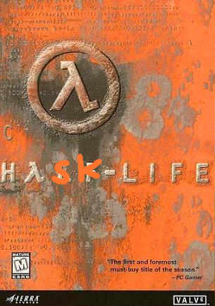
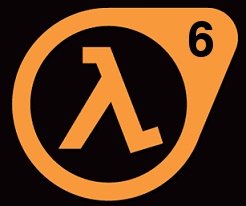
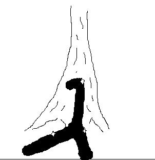
participants (57)
-
 Aaron Tomb
 -
 Alexander Dunlap
 -
 Andrei Formiga
 -
 Andrew Coppin
 -
 Benjamin L.Russell
 -
 Brandon S. Allbery KF8NH
 -
 brian
brian -
 Clifford Beshers
 -
 Colin Paul Adams
 -
 Corey O'Connor
 -
 Daniel Fischer
 -
 Darrin Thompson
 -
 Derek Elkins
 -
 Don Stewart
 -
 Eelco Lempsink
 -
 George Pollard
 -
 Gianfranco Alongi
 -
 Gwern Branwen
 -
 Henning Thielemann
 -
 Isaac Dupree
 -
 J. Garrett Morris
 -
 jagrhask
 -
 Jeff Heard
 -
 Jeff Wheeler
 -
 jerzy.karczmarczuk@info.unicaen.fr
 -
 Johan Tibell
 -
 John Dorsey
 -
 John Van Enk
 -
 Jonathan Cast
 -
 Ketil Malde
 -
 ksvanhorn
 -
 Lennart Augustsson
 -
 Luke Palmer
 -
 mail@justinbogner.com
 -
 Malcolm Wallace
 -
 Martijn van Steenbergen
 -
 Martin DeMello
 -
 Matthias Kilian
 -
 Michael Giagnocavo
 -
 Miguel Mitrofanov
 -
 minh thu
 -
 Nathan Bloomfield
 -
 Neal Alexander
 -
 Neil Mitchell
 -
 Niklas Broberg
 -
 Regis Saint-Paul
 -
 Richard O'Keefe
 -
 Ross Mellgren
 -
 sam lee
 -
 Sterling Clover
 -
 Thomas Davie
 -
 Thomas Schilling
 -
 Tillmann Rendel
 -
 Tristan Seligmann
 -
 wman
wman -
 wren ng thornton
 -
 Álvaro Vilanova Vidal